Prototyping with CSS Flexbox
/62
Since giving my first UX Bootcamp workshop on Prototyping in Code, I’ve been looking at ways to make it easier to teach CSS layout. I’ve tried demonstrating floats in a fish tank and how positioning works using diagrams and sketches, but it still seems pretty abstract to a CSS beginners.
I’ve been having a read through the specs for the Flexible Box Layout Module. The name describes the behaviour of the boxes which can stretch and expand to fill content, with unused space being distributed amongst the boxes. This is what we often try to achieve when floating elements.
The float method
A couple of years ago, I wrote a blog post on using nth-of-type to create grid blocks that clear. In it, I explain how you can use floats and nth-of-type to add margins to specific boxes, and get the correct ones to clear. This solution doesn’t rely on using classnames as a hook, so it means you don’t have to keep editing the markup if you decide to have 4 columns instead of 3. However, trying to explain this all to a group who have only been writing CSS for a few hours is heavy going.
The post doesn’t do a great job of demonstrating how the code works and I’ve since optimised the code, so I’ve added a version of the floats examples you can play with in jsbin. It also uses media queries to linearise the content at a smaller viewport.
How Flexbox works
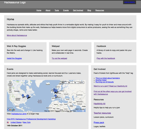
I’m still learning the ins and outs of Flexbox, but I’ve been testing it out making an interactive prototype for the re-development of the Hackasaurus website. Once I’d got to grips with it, developing the prototype took considerably less time than my usual method of floats and positioning.
If you want to have a play, here’s a demo of a Flexbox prototype I put on jsbin.
Be aware that the syntax is in flux at the moment so you will need browser prefixes and these examples may be out of date depending on when you read this, so check the spec. It’s not yet supported by Opera or IE, but there’s a page on “can I use” that lists specific versions. It’s not something I’d feel comfortable about implementing into live projects until it’s stabilised a bit, but for quick prototypes it’s fine.
To set up Flexbox, create an element with children. In the CSS, set display:box on the parent, and box-flex:1 on the children. All the children will adapt to fit the width of their content and their parent. Widths are calculated automatically so you don’t have to worry about the box-model’s pixel-width borders messing up your percentage-based dimensions.
This is the bit I find a bit odd: if you want the boxes to be distributed evenly, add a width to the children. I want to set a width of 100% to the children so that browsers that don’t support Flexbox just linearise the content, but it won’t accept percentage widths. Even setting a percentage for the margins doesn’t seem to have any effect.
Oli Studholme does an excellent job of explaining limitations like this, and suggests using width:0 as a workaround to force it to have a width. I’m not sure about this since it feels a bit dodgy as a fallback for browsers that don’t have Flexbox, but it’s all still in development. For a prototype my goal is making something quickly for demonstration rather than proper use, so I’m not worrying about browser support.
Other fancy stuff you can do with it
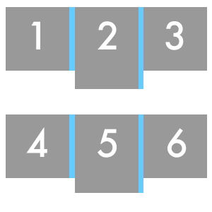
As well as making columns with widths that spread out equally, you can have columns of different widths with a few more tweaks. Suppose you want 2 columns with one column bigger than the other. Set display:box on the parent, and on the child you want to be bigger, put box-flex: 1. On the child you want to be smaller, put box-flex: 2.
In my prototype, I set all my boxes to have box-flex: 1;, and I have a class called .mini which I give to boxes I want to be smaller, and this applies box-flex: 2. Not the most semantic classname, but it’s just a demonstration.
You can also set boxes to stack vertically, and the most exciting of all (to me, anyway) is being able to reorder where they’re displayed. Think of the potential with responsive designs…
Oli has some juicy examples of things you can do with Flexbox. His article was written in January so I think some of the things he’s mentioned as not being implemented properly in Firefox are working now. It’s a really interesting read, and full of examples.
There’s also a Flexbox playground where you can test out all the possibilities.
Teaching Flexbox
Depending on how I get on with this, I’m planning on teaching Flexbox to my Prototyping in Code workshop students next week. It’ll be useful as an introduction so they can get something working quickly. It would mean people could build a layout in CSS without having to learn all of these things first:
- Why mixing pixels and percentages sometimes breaks things.
- What “clear” does (and the difference between clear:left, clear:right and clear:both).
- How float:left and float:right work.
- Why having everything floated in a container can make its background colour disappear.
- How to stop content trying to wrap round floated elements where they shouldn’t.
- How to get columns that are next to each other to be the same height.
All essential things for a developer to know, but not for people who are trying to mock something up quickly with code that won’t be used in a live project.