Using nth-of-type to create grid blocks that clear
/29

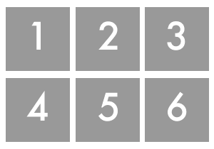
Problem: You want to create a grid based layout with floats, but you don’t want to wrap things in extraneous divs to force blocks to clear properly.
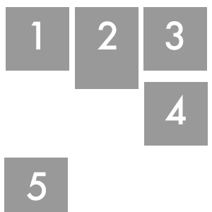
In an ideal world, all the content is the same height, and blocks will float and clear properly. But this is not an ideal world.

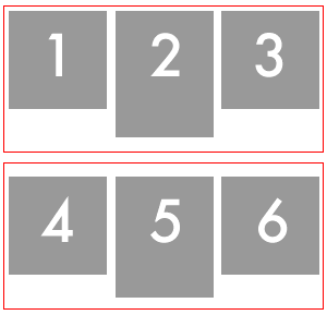
One way of achieving this is by wrapping a div round the first three blocks which clears the content above. But this means adding extraneous divs to your markup, and can't always be done easily in a CMS.

nth-of-type to the rescue!
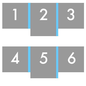
If we know how many blocks are going to be in each row, we can tell which ones to clear using the nth-of-type selector.
So this code clears the 4th, 7th and 10th block
	.block:nth-of-type(4),
.block:nth-of-type(7),
.block:nth-of-type(10) {
  clear: both;
}
And this code adds margins onto every first and second block in a row. (You can probably think of a more streamlined way of doing this if you’re better at maths than me!)
	.block:nth-of-type(1),
.block:nth-of-type(2),
.block:nth-of-type(4),
.block:nth-of-type(5),
.block:nth-of-type(7),
.block:nth-of-type(8),
.block:nth-of-type(10),
.block:nth-of-type(11) {
  margin-right:40px;
}

Browser Compatibility:
Unfortunately, not many browsers currently support this. Firefox 3.1+, Safari 4.0, Chrome, Konqueror, and Opera (albeit incorrectly). But if you’ve got a high proportion of users on these browsers, you can have a go at implementing this and get it to degrade quite nicely.