Experiments with Adobe Edge
/58
A development version of Adobe Edge came out today, and I thought I’d give it a quick play to see whether it would be useful for any of the projects I’m working on.
I’m trying to keep an open mind since the software is still in development, and I’m grateful to Adobe for releasing a version with the opportunity for developers to give feedback before the product is generally released.
I built a quick demo animation to see if it could be used as part of the Hackasaurus X-ray goggles page. Flash is blocked in a lot of places where we run workshops, so having a demo video of how to use the Goggles might be handy.
Using Edge

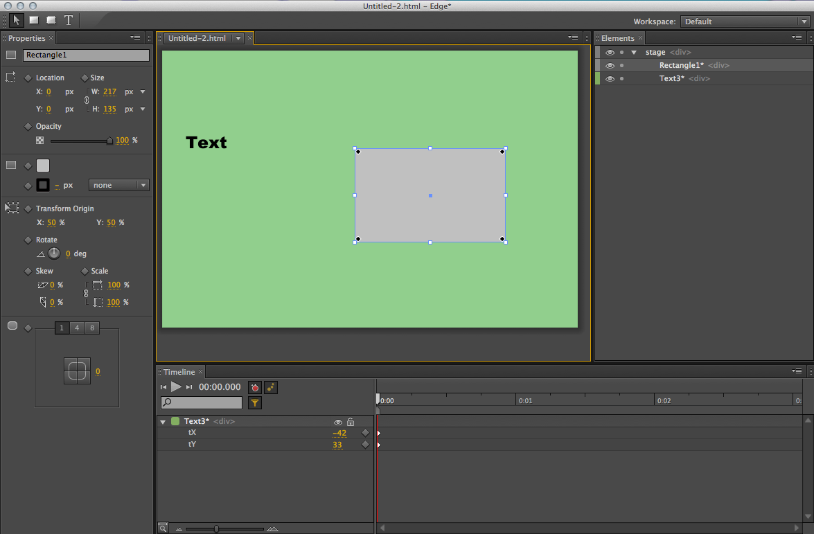
My first impressions of the software were positive. It has a very clean layout and feels less cluttered that a lot of Adobe’s products. The grey text on a grey background isn’t very friendly on the eyes though.
I used Flash quite extensively before I got into the web, so the concepts of timelines and keyframes are familiar to me. However, the interface feels very alien, and getting things to work is fiddly. It doesn’t work like Flash does, but I don’t think it’s trying to be like Flash.
Most of the language used is borrowed from CSS. For example, you can set the “overflow” of the canvas to be “hidden” or “visible”. You can also set various tweens to animated elements which use the same names as in jQuery. The generated code uses the jQuery library.
After exporting the file, I added a script to make the animation loop because this isn’t possible from within the editor yet.
Adding text

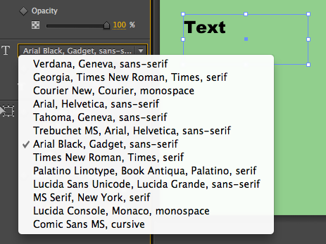
There’s a limited choice of fonts which makes sense, but there’s no way to change the font stack in the editor.
I can size text (and shapes) in pixels or ems which is handy.
The actual text in the generated animation is selectable, but each bit of text gets wrapped in a <div> tag rather than anything semantic like a paragraph or heading.
Shapes
There aren’t many options for shapes yet, just the choice between a rectangle and a rounded rectangle. Either more shapes are coming, or Adobe expect people will import shapes from other software like Photoshop or Fireworks.
I would like the option to select percentages rather than fixed widths on elements, as I work with mostly flexible-width sites. In fact, I want this feature for Fireworks too!
The code

The animation relies heavily on CSS and Javascript so make sure content can degrade nicely with these turned off.
Overall, I’m unimpressed by the code that Edge generates. Everything is output as a <div>, including the text. It’s a shame that there isn’t the option to change the tags used. However, based on the interface I’m pretty sure this might be something a future version will allow
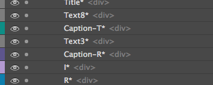
In the layer pane, each element has its tag labelled next to it. Since every element has the same <div> tag, why bother putting that label there at all unless an option was intended to be there to change it? So I’m hopeful.

The Edge team have also hinted towards support for more HTML elements in their forum in response to Rob Hawkes’s question about this same issue.
Marketing
I’m disappointed that Edge is being marketed as an HTML5 tool, because I think this reference is misleading. The only thing I can see in the code that is HTML5 is the doctype.
Despite this, I’m encouraged by how the Edge team are engaging with developer feedback in their forums, and it feels like they’re open to ideas and working on ways to make the software output more semantic code using things like canvas.
I’m left wondering what sort of things people will find Edge useful for. I hope not just as a selling point by web agencies as an alternative to Flash ads.
Possible use cases
You can’t create hotspots or turn any of the content into links within the editor, so at the moment what I’m building feels like a fancy animated gif. That pretty much rules out using it for prototyping, games or presentations.
Depending on how much Adobe plan on charging, it might have a place in schools. Animation software always goes down well, and the output is more flexible. It’s bloody fiddly to use though.
As with all new technology, we’re producing lots of demos that look pretty but don’t really do anything particularly useful. We’re still at that teething stage with animation, and I’m looking forward to seeing more practical examples emerge.