Selling Poor User Experience
/30
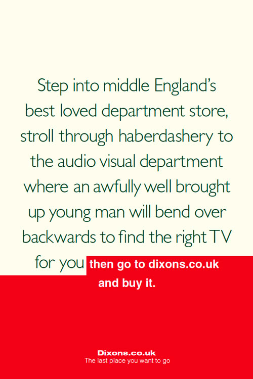
While on the train to Future of Web Apps, I saw some adverts for Dixons displayed in the carriages. Here is the text from one of them:

I thought this was a really clever, albeit cheeky advertisement. It is brutally honest, and makes the point to look elsewhere for a better browsing experience, but once you’ve tasted what’s on offer, to go to the place that sells it cheaper. It draws upon the fact that although we love good user experience, we are heavily swayed by price.
However, what does this say about user experience? This ad suggests that only the luxury retailers can offer it, that it’s expensive, middle class and unnecessary after the product has been chosen. But is it? Surely good user experience extends beyond the point of sale, and even in a recession, it should be an investment, not an overhead.
Have Dixons shot themselves in the foot, or do they have a point? Is good user experience only for the high-end of the market, and should retailers like Dixons continue to scrimp on customer service and let retailers like John Lewis pick up the bill?