The Making of maban.co.uk
/1
This website has been up and running for over a year. However, I was so ashamed of the last design that I didn't tell anyone about it. And what's the point in having a website that you don't want anyone to see?
Pre-Redesign
The previous incarnation of the site was made entirely in Flash. It was made to look like a book with tabs down the side. When a tab was clicked on, a hand would turn the page.
When I first made it, I was immensely proud. But a lot of people didn't like it because Flash = Bad. Personally, I love Flash because of all the cool stuff you can do with it. But a lot of people don't love it at all and want nothing to do with it (which is understandable but perhaps a little unfair) …I think I'll leave that rant for another day. Besides that, I wanted a site with a blog so I can indulge the emo teenager in me, and to get to grips with stuff like CSS and PHP. No doubt this site will have something so terribly coded that it will turn into a black hole and destroy the Internet. (Therefore, I'd really appreciate it if you could point out my ignorance so I can amend the offending code.)
Preparation
I started planning out how it would look a few months ago. I knew I wanted something quite far removed from the typical web 2.0 shiny buttons look, but also look modern, and reflect my personality.
One of the things that surprises people when they find out more about me is how I hate using computers for tasks that humans can do just as well, or even better, which is surprising because I seem to spend most of my time on the computer. Drawing pictures straight onto the computer is great because if you make a mistake, you can go back and change it. But I think some of the best websites incorporate hand-made images. Websites such as webdesignerwall.com are a perfect example of this.
I think this area of design is likely to make a huge come-back because vector drawn images are so common now. In my opinion, a hand-drawn image, although a bit more rough around the edges, shows more personality than a perfectly precise computer-drawn one. Which I think is great because I love drawing and using computers!
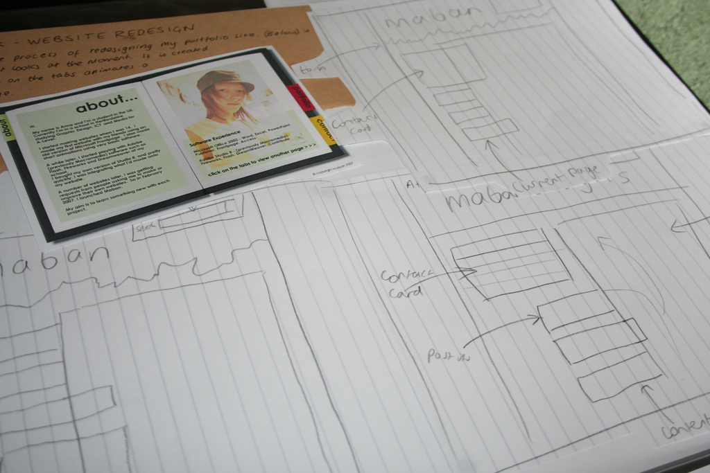
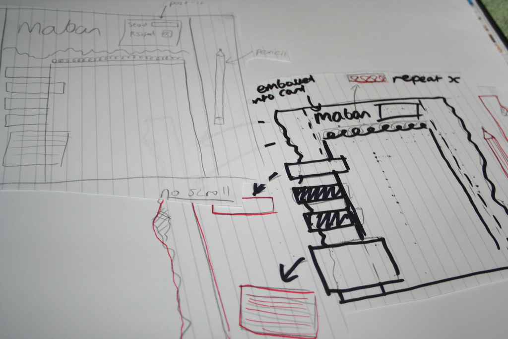
So with this in mind, I started sketching out ideas.
Ideas
I find sketching ideas out onto rough paper is essential before opening up graphics software because it's quick, and not restricting. If I were to start with the software, I'd worry too much about the details rather than the bigger picture.

Overall I think I did about 12 sketches of how it would look. Every time I started a new sketch, I'd think of something else I could add or move about.

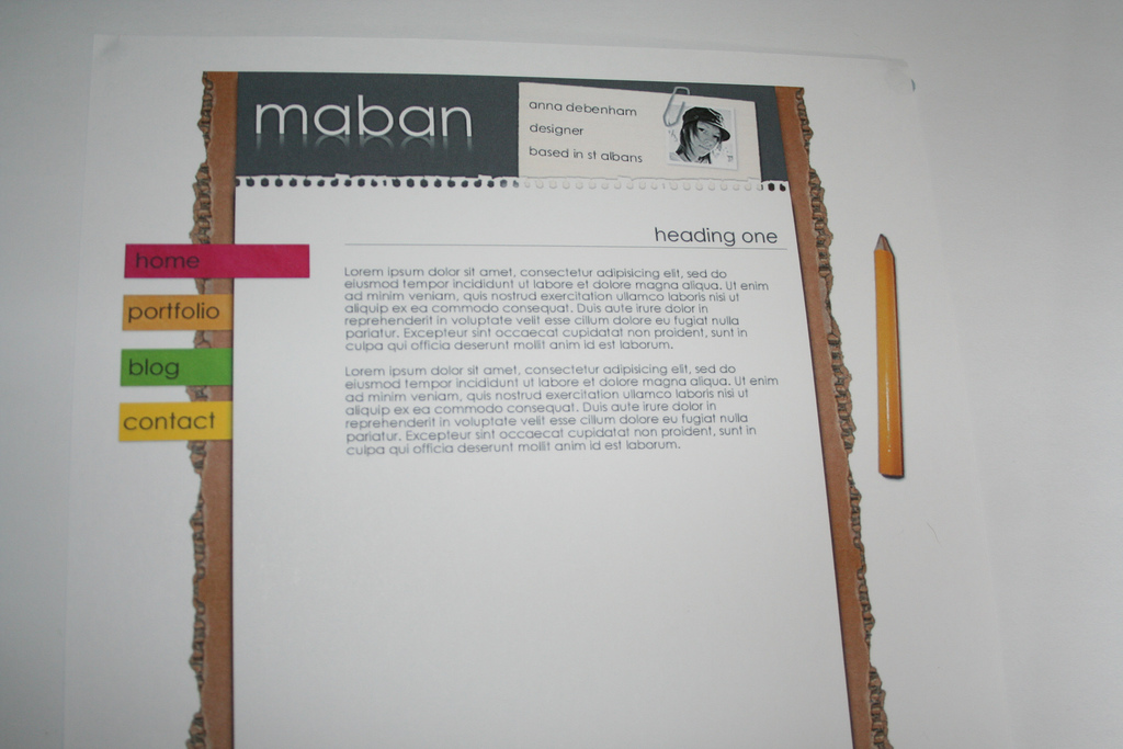
This is what I thought my final design would look like. I did this on Macromedia (now Adobe) Fireworks. I made a few modifications because I wanted things like a Flickr feed and a blogroll.

Building the Site
So now I finally had my idea. The next step was to put this onto my site. This was much more problematic than I'd anticipated, hence the reason it took so long! I'd transferred my domain but it hadn't been sent properly, and seemed to be dangling in limbo. It took a while to sort out, but it seems to have all transferred over now.
CMS Dilemma
I originally wanted to use the CMS Drupal, which isn't really a blogging CMS, but out of the ones I'd tried (including Joomla! and Mambo which I hated), Drupal was the most intuitive. However, I had yet more problems installing this. (The 5 minute install is such a lie!) and decided to try Wordpress. Good decision? Well, as much as I love Drupal, I think Wordpress suits the needs of this website better.
Coding
I started off with the default template and modified that, then when I understood what I was doing, I loaded a blank template and started from scratch. I have been CSSing for a few months now (since I was lucky enough to go on Rachel and Drew's 'Edge of My Seat' training course) so I'm feeling quite confident with using CSS. (In fact, I think it's the best thing since Ben and Jerrys made half baked cookie dough icecream!) But I'm still learning, so this was a great opportunity to put into practice what I'd learned. PHP is very new to me, and although I did as little as I could get away with, it seems a bit less scary than before I started. Tools such as Firebug proved invaluable!
Why Maban?
And finally, why did I choose the name Maban? I wanted something short and easy to remember, but also with a hidden meaning that described my 'brand values'. I tried clicking Wikipedia's "random article" link to come up with some ideas, and one of the articles was about a word called 'Maban' that is an Aboriginal word for magic. Perfect!